Product design / Practical notes
A Website UX Checklist for Software Companies
A software website should help someone understand the offer, find relevant proof and decide whether to get in touch. Review that path before polishing isolated sections.
Test the opening explanation
Give a first-time visitor a moment to read the opening, then ask what the company does and who it helps. Their explanation will tell you more than asking whether they like the design.
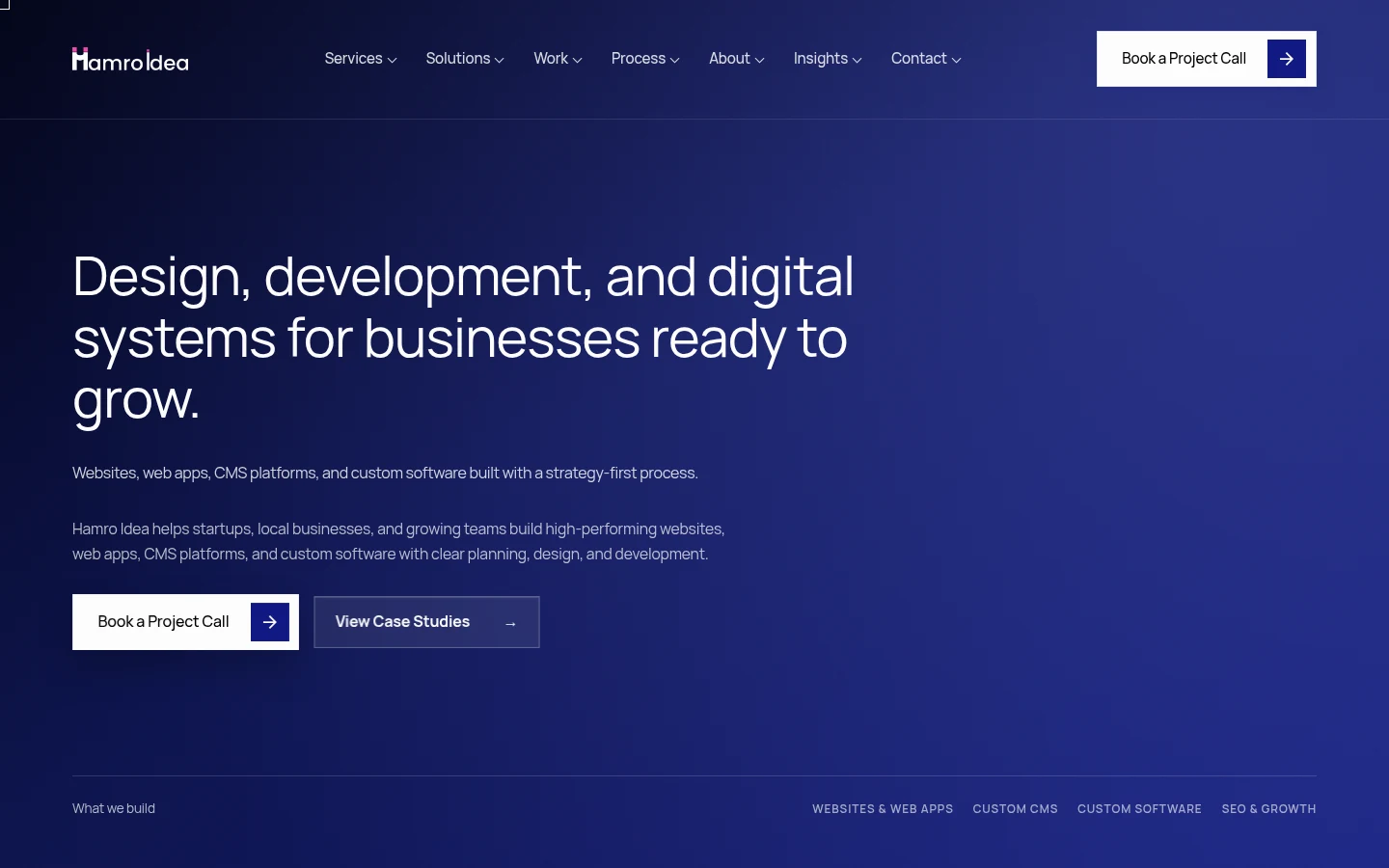
The public Hamro Idea demo is a concrete website reference. I would review its introduction, service paths and route to contact together.
Review the evaluation path
| Visitor question | Useful page evidence |
|---|---|
| Does this fit my problem? | Specific audience, use case and scope |
| What does it do? | Capabilities explained through tasks |
| Why should I believe it? | Relevant examples and inspectable references |
| What are the limits? | Clear exclusions and dependencies |
| How do I continue? | An appropriate demo, documentation or contact action |
Keep proof next to the claim
A screenshot is useful when it helps inspect a capability or a design decision. A logo or decorative interface image does not establish a customer result. Narrow the claim when the available evidence is narrow.
The Mokshya case concerns website communication and technical reading depth. The Splashnode case concerns a technical platform website and frontend contribution. Neither should be inflated into ownership of the underlying protocol or platform just to make a stronger sales story.
Review contact as the next step in the same journey
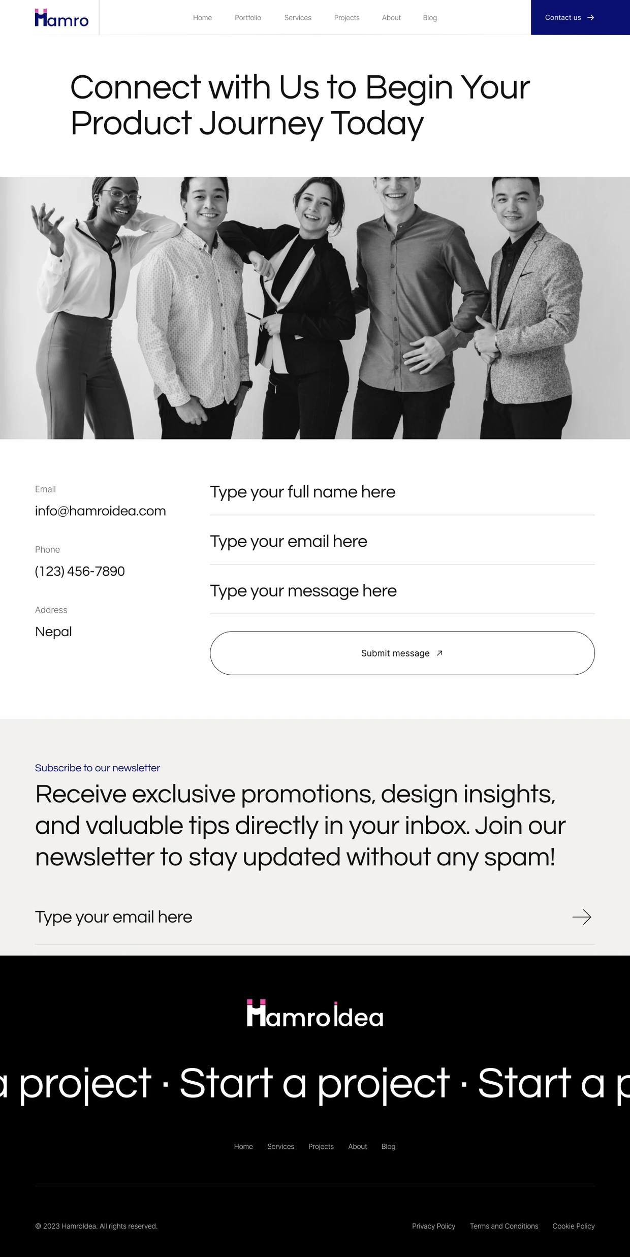
The historical Hamro Idea contact design keeps the first request small: name, email and message. Its surrounding navigation connects it to the service and project pages.
The layout is only part of the review. Persistent labels, useful errors and a genuine delivery result need checks in the working form. The screenshot is a historical design example with sample content.
Review the actual page, not only the design
- Read meaningful content with scripts unavailable where feasible.
- Check headings, descriptive links and image alternatives.
- Use the navigation and contact path with a keyboard.
- Review long headings, zoom and narrow screens.
- Measure image, font and script loading with real page data.
- Verify metadata, canonical URLs and the intended destination of old links.
Use findings to refine the offer
If visitors cannot identify the right service, the repair may be information architecture rather than a new hero. If the page makes unsupported claims, the repair is evidence or narrower wording. Technical SEO and performance support discovery and access; they cannot make an unclear offer useful on their own.