AI/Web3 R&D lab · Website communication
Mokshya.io
Introducing an AI/Web3 lab and giving visitors a clear way to explore its work or start a project.
- Contribution
- Website UX and product communication contribution
- Evidence
- Existing portfolio material; original screen evidence incomplete
The project and my part in it
I worked on website UX and product communication for Mokshya. The retained homepage introduces an AI-Native Web3 R&D lab, with a broad headline followed by a more specific explanation of its work.
The website needed to serve visitors at different stages. Some want to understand the lab and its experiments; others already have a project to discuss.
What shaped the design
- Technical positioning needs a concrete supporting explanation.
- Exploring the work and starting an inquiry are different visitor intentions.
- Navigation and visual identity must support the opening message.
THE DESIGN CHALLENGE
How can an AI/Web3 lab introduce its work and offer a useful next step without asking visitors to trust an unsupported claim?
I focused on the opening sequence: introduce the lab, explain the offer in more concrete terms and give each visitor a useful next step.
Give the headline a concrete explanation
The headline sets the direction, while the supporting sentence names AI agents, applications and Web3 infrastructure. That second layer does the practical work of explaining what the lab is talking about.
I treated the headline and description as a pair. The visual opening can attract attention, but the next sentence needs to help someone explain the offer in their own words.
A broad introduction needs a specific follow-up before it can support a useful decision.
Separate exploring from starting a project
Explore and Start a project meet different intentions. The navigation also makes Experiments visible, giving someone who is still evaluating the lab a place to look further.
The distinction matters because a visitor should be able to learn before committing to an inquiry. A project-ready visitor should also have a direct route forward.
Two actions are useful when their labels make the difference between them clear.
Let the presentation support the explanation
The dark opening and colored glow give the page a recognizable look. The compact navigation and logo row sit around the introduction without taking over the headline.
For the next review, I would inspect the actual destinations and narrow-screen layout. The retained desktop image gives a useful view of the composition, but those behaviors need the working site.
Visual polish can introduce a technical business; specific work and accurate relationship labels have to support its claims.
Existing portfolio preview
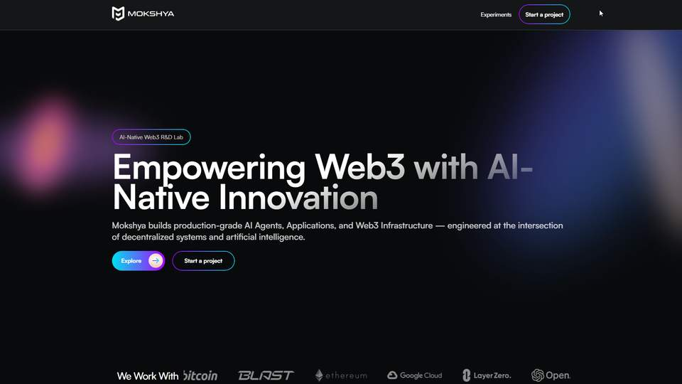
Retained portfolio presentation. A matching original Figma screen has not been verified for this case.
What I delivered
The retained homepage shows the opening, navigation and two main actions within my website communication contribution.
Public material for this case is limited. This account stays focused on my contribution, its design decisions and the questions that deserve further validation.
Outcomes and next steps
The case explains the visible website decisions. No conversion, comprehension or technical-delivery result is available to report.
What I would test next
- Ask a first-time visitor to explain the lab’s offer from the category label, headline and supporting sentence, then identify the next route they would choose.
- Inspect the actual Explore, Experiments and Start a project destinations when a working source is available; check the evidence behind each capability and relationship claim.
What I learned
The next sentence after a broad promise often matters more than another visual flourish. It gives the visitor something concrete to understand.