B2B consulting · Service and sector website
Morajaa
Helping a prospective client understand a consulting service before starting a conversation.
- Contribution
- UX, content structure and website design contribution
- Evidence
- Complete original Figma screens · sample design content
The project and my part in it
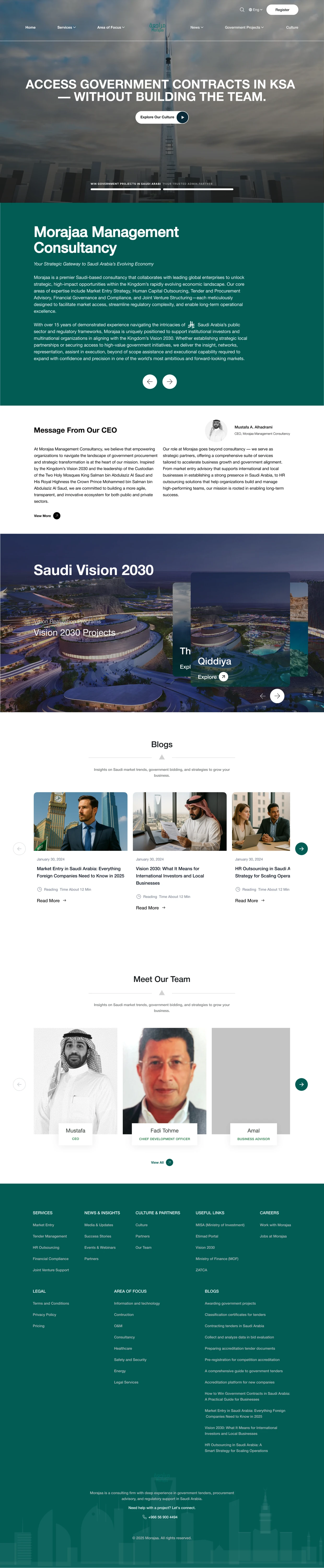
Morajaa presents consulting services across several sectors. A visitor may know the business problem they face without knowing which service name fits it. I worked on information architecture, service and sector pages, and the path to an inquiry.
The challenge was to explain enough of the engagement for a useful first conversation, while keeping a long service page easy to scan.
What shaped the design
- Visitors may recognize a business problem before a service category.
- Long service explanations still need a useful first scan.
- Service and sector pages should connect without repeating the same introduction.
THE DESIGN CHALLENGE
How can a visitor evaluate a complex consulting engagement before speaking to sales?
The homepage introduces the offer. Service pages explain the work in more detail, and sector pages give visitors another way to find what is relevant to their business.
Explain the work before asking for contact
The market-entry page moves from a service introduction into setup, ongoing support and a named process. Those sections give the inquiry action some context.
I wanted a first scan to answer whether the service fits, with enough detail underneath for someone who is ready to read further. The homepage gives that explanation a place in the wider offer.
Short introductions help people get started, but an involved engagement also needs room for detail.
Make the process easy to follow
Named stages help a visitor understand the shape of an engagement before reading every paragraph. The service examples use that structure for different kinds of work, including joint ventures, tender management and HR outsourcing.
The reusable pattern is the reading order. Each page still needs its own explanation of what the work includes and where the consultancy’s responsibility ends.
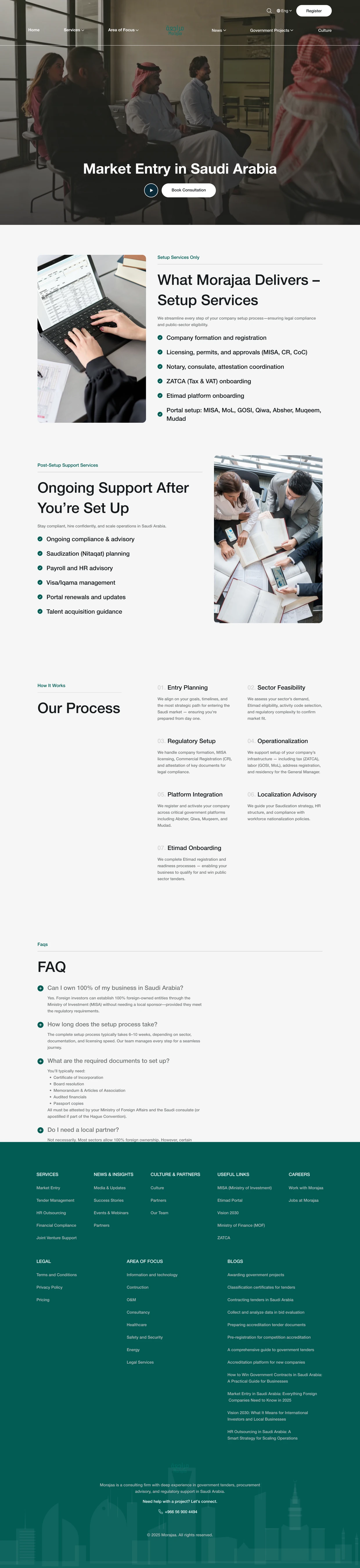
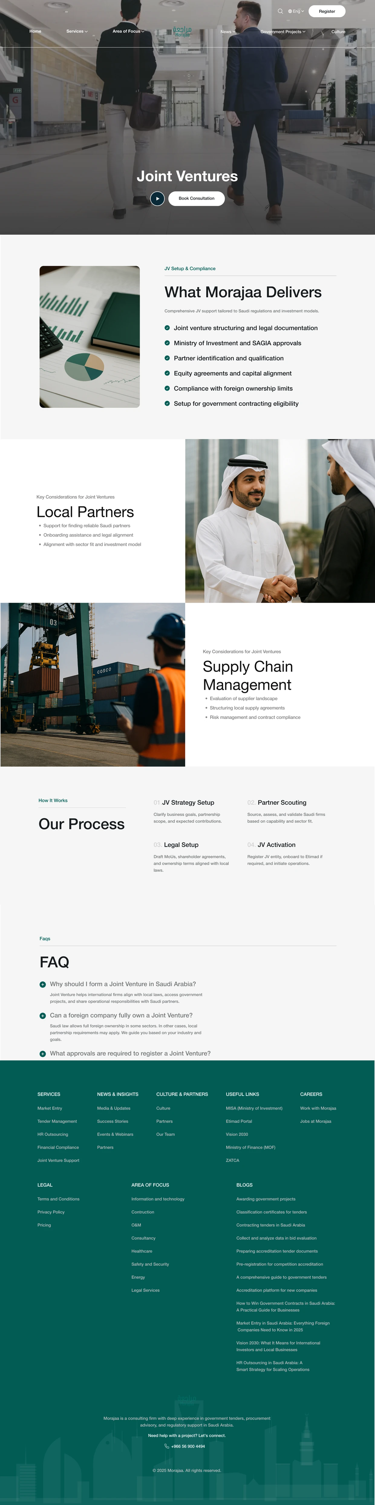
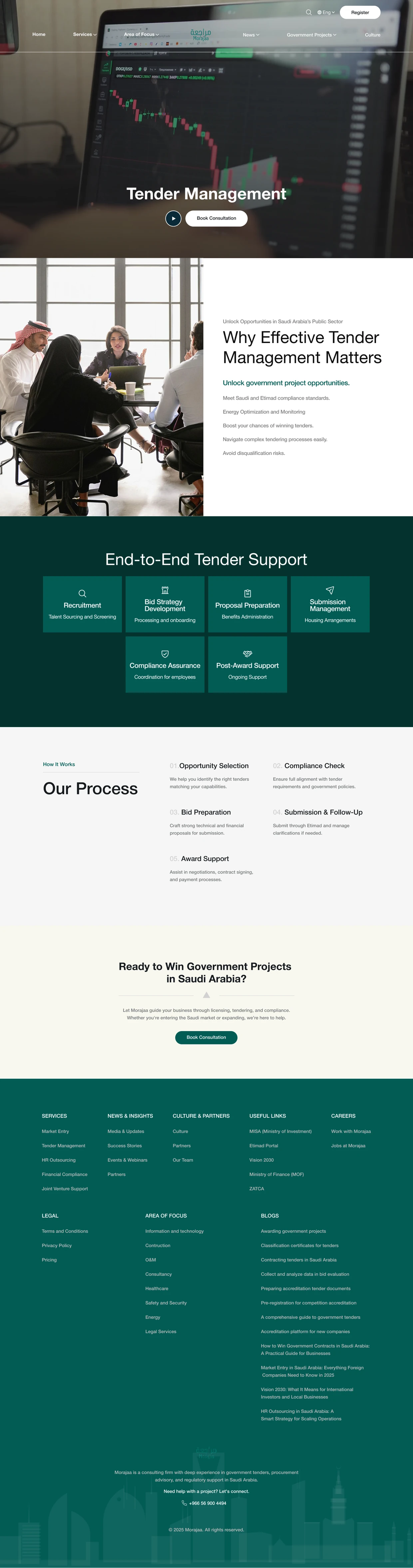
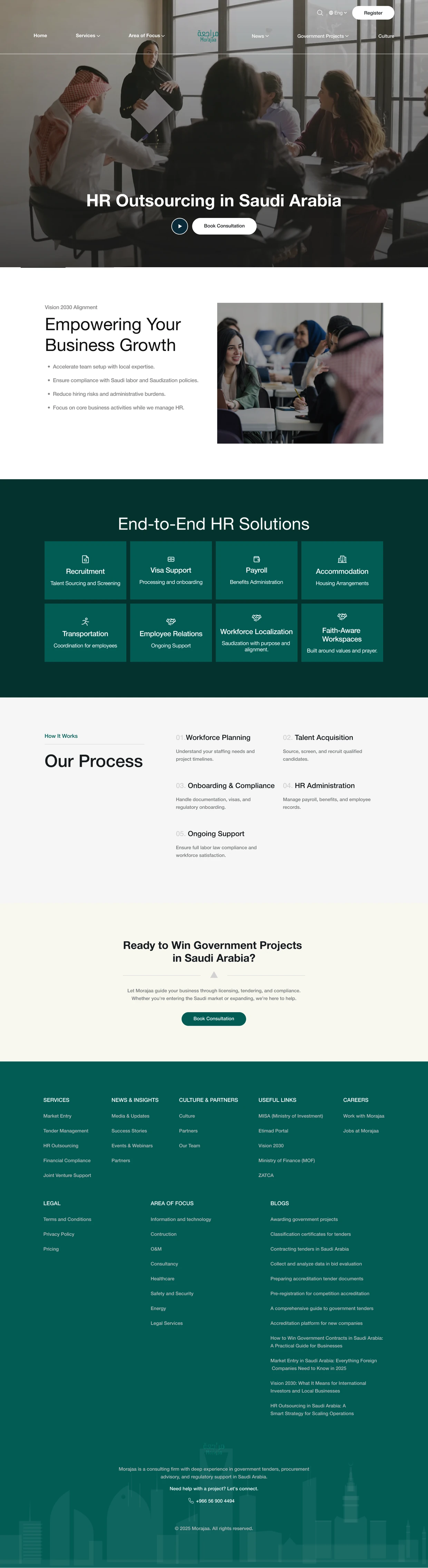
A shared page pattern should make services easier to compare without making them sound interchangeable.
Offer a second route through the sectors
Some visitors begin with a service. Others begin with their industry. Sector pages give healthcare and technology visitors a more familiar starting point, then lead into relevant service detail.
I treated these as connected paths through the same offer. The sector page should help someone find the right explanation without making them read the same introduction again.
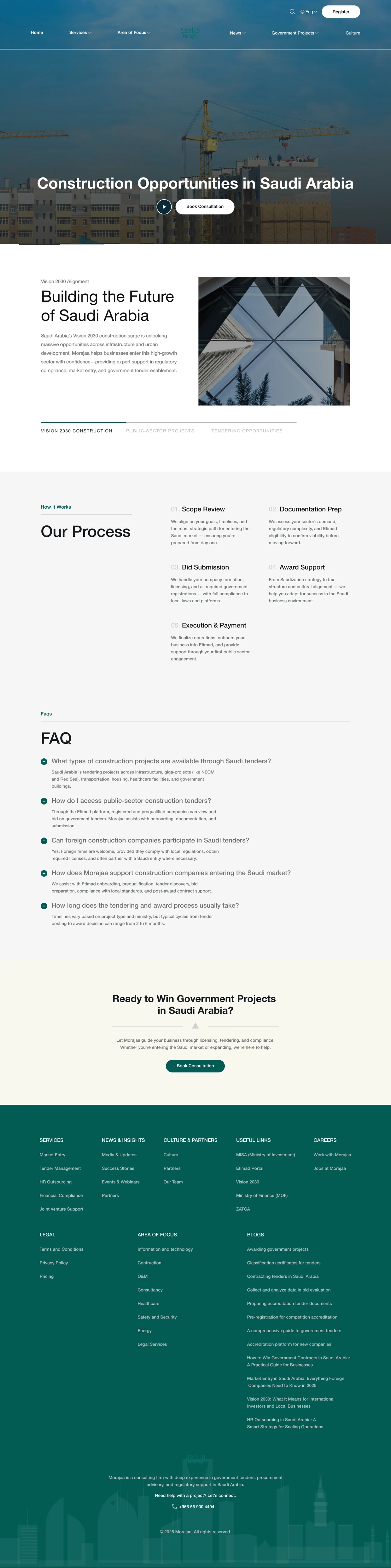
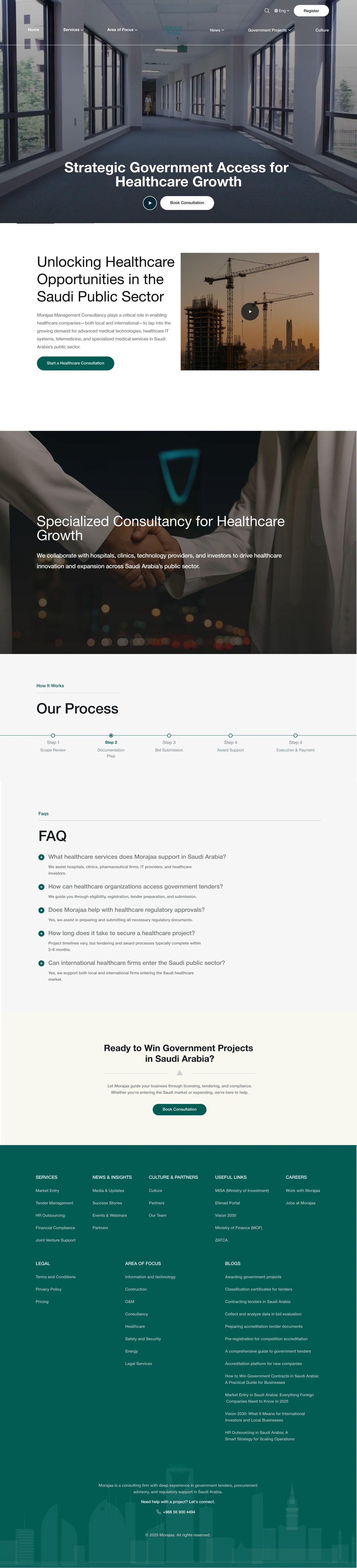
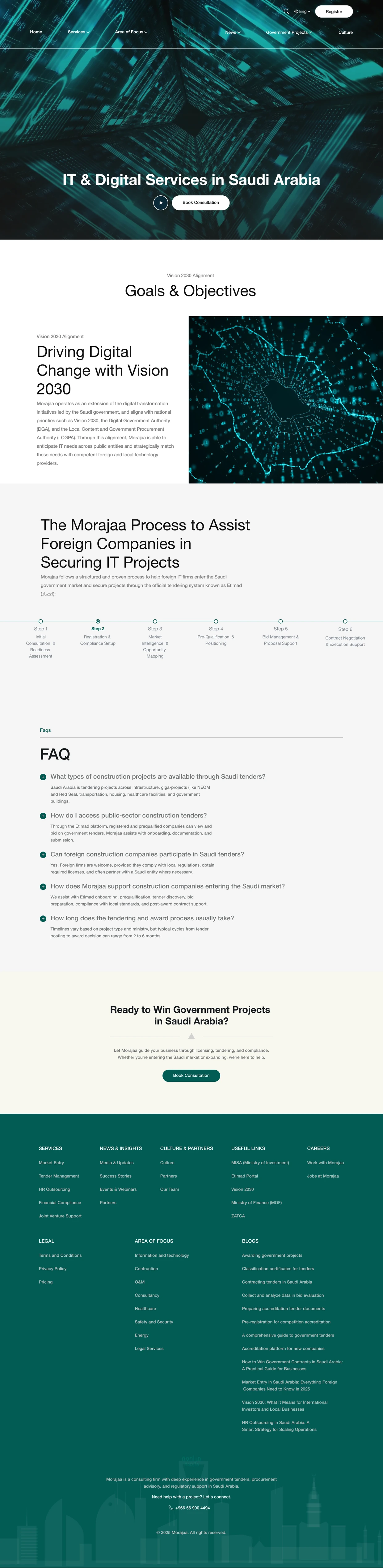
Two entry routes are useful when they lead into a coherent set of pages.
What I delivered
The work includes homepage, service and sector structures, with complete design screens showing how the reading paths connect.
Outcomes and next steps
The design gives the consultancy room to explain a complex engagement. Inquiry or sales performance was not measured for this case.
What I would test next
- Ask a prospective client to identify the relevant engagement stage and explain what the consultancy would deliver.
- Check whether the process section answers the question raised by the service promise before the visitor reaches contact.
What I learned
People often arrive with their own description of a problem. A service website should help them connect that description to the work on offer.