Technical platform · Website design and frontend
Splashnode
Explaining a technical platform through the work a prospective buyer needs to do.
- Contribution
- Website designer and frontend contributor
- Evidence
- Existing portfolio material; original screen evidence incomplete
The project and my part in it
I worked on website design and frontend implementation for Splashnode. The existing project material describes content, device and data-management capabilities. The website needed to make those capabilities understandable to a prospective buyer.
The challenge was explaining where the platform fits before asking someone to work through a long feature list.
What shaped the design
- Technical capabilities need a recognizable use case.
- Introductory content and deeper detail have different jobs.
- The frontend must preserve hierarchy as copy and viewport size change.
THE DESIGN CHALLENGE
How can a technical platform website help a buyer connect capabilities to a real use case?
I connected capability explanations to a reading path: understand the use case, inspect the relevant detail and find a sensible next step.
Connect a capability to a task
A feature name becomes more useful when someone can connect it to work they recognize. I organized the explanation around the use case before adding the supporting capability detail.
That gives the opening a different job from the deeper sections. The introduction establishes relevance; the rest of the page helps someone evaluate the fit.
Short explanations help a first scan, while technical buyers still need access to meaningful detail.
Keep the next step easy to find
A visitor may want more detail, an example or a conversation. I treated action placement as part of the reading order, so the next step follows the information that makes it useful.
The page should make it possible to keep evaluating the offer without repeatedly interrupting the reader with the same inquiry request.
Calls to action need enough visibility without competing with every explanation.
Work through the layout in code
Frontend work let me review the composition with real text lengths, wrapping and navigation behavior. Those constraints help reveal whether a section still makes sense outside the initial design frame.
I kept the visual hierarchy and reusable page patterns connected to that implementation work. The retained preview shows the website’s visual context.
Reusable sections need to tolerate content changes, not just match the first arrangement.
Existing portfolio preview
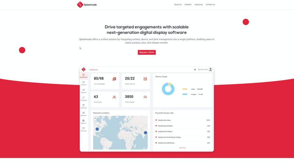
Retained portfolio presentation. A matching original Figma screen has not been verified for this case.
What I delivered
The contribution joins website information hierarchy, responsive composition and frontend structure.
Public material for this case is limited. This account stays focused on my contribution, its design decisions and the questions that deserve further validation.
Outcomes and next steps
This case describes the website work. Operational reliability and commercial outcomes of the underlying platform are outside the evidence available here.
What I would test next
- Ask a buyer to connect one platform capability to a task in their own work, then find an appropriate evaluation step.
- Review the page with real copy lengths and narrow viewports; check that the use-case explanation still leads naturally into capability detail.
What I learned
Working with the content in the browser makes hierarchy a practical design decision. The page has to explain the offer after the ideal text lengths change.