Hosting and infrastructure · Static website
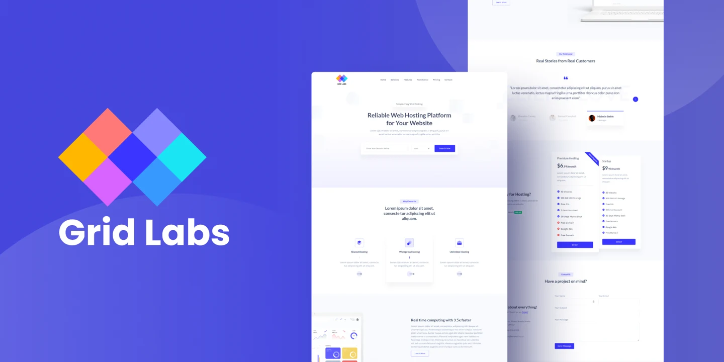
Grid Labs
Making hosting plans easier to compare without turning the page into a wall of specifications.
- Contribution
- Website and frontend design contribution
- Evidence
- Independently captured current public demo
The project and my part in it
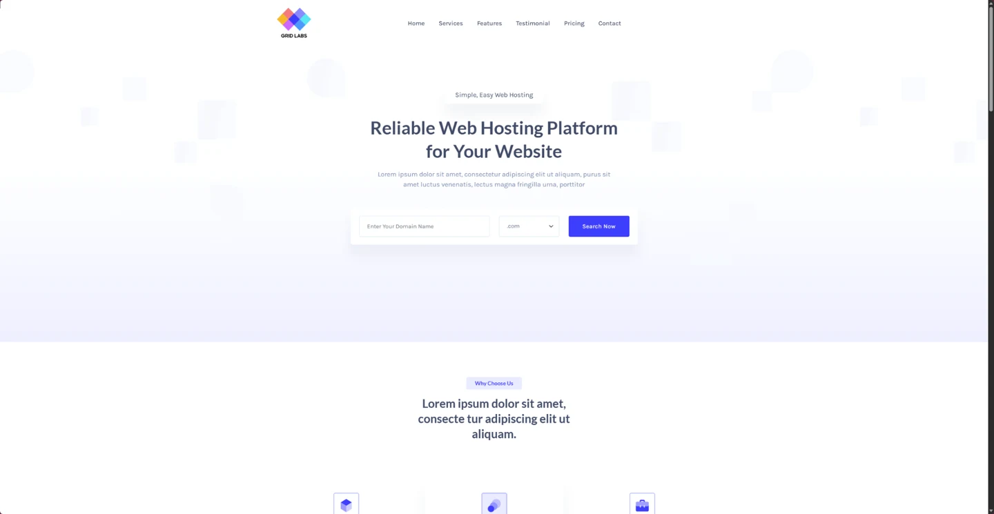
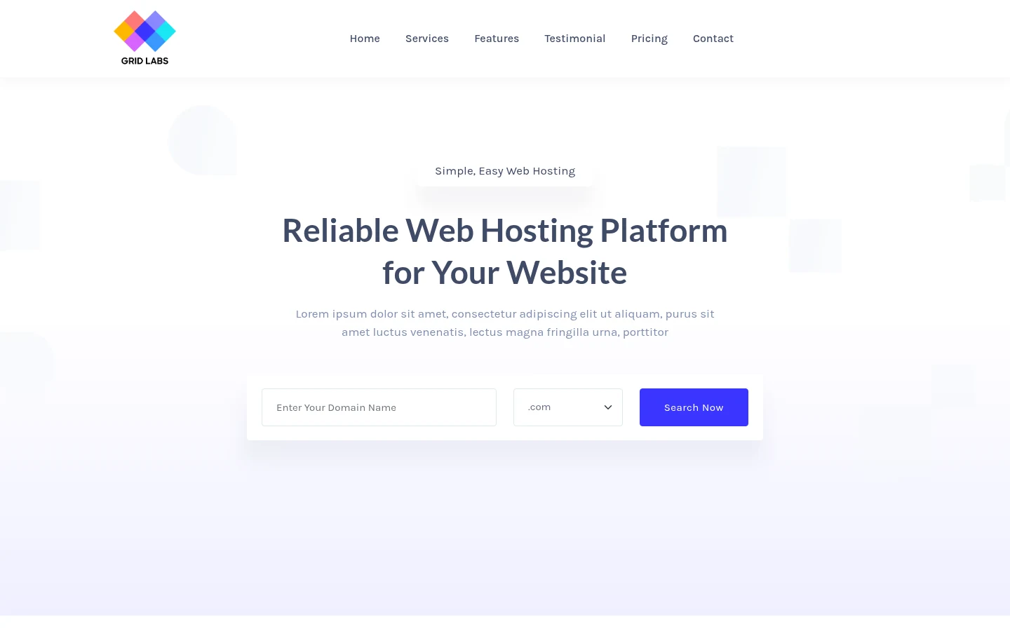
Grid Labs is a hosting and infrastructure website. I worked on its commercial hierarchy, plan presentation, domain-search affordance and static frontend.
A prospective customer needs to understand which service fits and how plans differ. The challenge was putting those decisions ahead of the full specification list.
What shaped the design
- Plan attributes need consistent labels, units and billing periods.
- Stacked cards make direct comparison harder on narrow screens.
- A static site must be clear about what its actions actually provide.
THE DESIGN CHALLENGE
How can a hosting buyer compare plans without carrying every specification in memory?
I focused the page on choosing a service, comparing its plans and understanding what happens after the next action.
Keep plan differences in a stable order
Equivalent plan details need the same labels, order and units. That lets someone compare the differences instead of remembering where each attribute appeared on the previous card.
Technical detail still has a place, but the attributes that change the choice deserve more attention. Current prices and commercial terms belong with the service owner; the historical site is used here to discuss the pattern.
Giving every specification equal weight makes the information harder to compare.
Help comparison survive a narrow layout
Stacking cards preserves their content, but it makes comparison depend more on memory. Repeated attribute labels help someone connect the same detail across plans.
I would review a narrow layout with two plans that differ in one important way. If finding that difference depends on remembering an offscreen card, the comparison needs more support.
A layout can fit the screen while still making the decision harder.
Make the next step honest
The domain-search field suggests a useful task, but the website in this case is a static implementation. Its destination and response need to match that scope.
The same applies to purchase actions. The page can help someone understand a plan without implying that account creation, billing and provisioning are all part of the demonstrated work.
An attractive action needs a clear destination and an accurate promise.
Current public demo
What I delivered
A commercial website and static frontend, with the focus on service hierarchy, plan comparison and maintainable page structure.
Outcomes and next steps
The work makes the plan-comparison decisions visible. It does not establish a live hosting-management, billing or provisioning service.
What I would test next
- Ask a buyer to choose between adjacent plans and explain which specification drove that choice.
- Repeat the comparison on a narrow screen with longer plan labels; preserve units and distinctions without requiring horizontal page scrolling.
What I learned
The label and unit beside a number are part of the comparison. Consistent detail often helps more than another highlighted specification.
Related work and reading
Earlier portfolio artwork