Keep process state actionable
Status, missing requirements, and the next available action stay close enough that users do not have to reconstruct the process from memory.
A multi-role fintech product designed around one recurring question: what is happening, what is blocking progress and what can I do next?
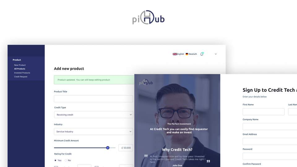
Hiring evidence
The strongest proof is not visual polish. It is whether each role can understand current state, outstanding requirements, available actions, waiting, failure, and recovery without the product contradicting itself.
Status, missing requirements, and the next available action stay close enough that users do not have to reconstruct the process from memory.
Dashboards can support scanning and comparison while application and verification steps reduce competing information around consequential decisions.
Submitted, reviewing, approved, rejected, and resubmission states receive explicit treatment instead of being reduced to a passive badge.
Investor, creditor, applicant, and admin journeys can diverge where permissions or tasks differ while retaining one understandable status language.
Inspect application, account, status, and credit-oriented interaction patterns.
Figma prototype for the creditor-facing flow.
Open creditor prototypeInspect role-specific information hierarchy and investment-oriented product states.
Figma prototype for the investor-facing flow.
Open investor prototypeInspect the operational side of the same product model and where permissions change available actions.
Figma prototype for the administrative flow.
Open admin prototypeEvidence boundary: these Figma prototypes are public design artifacts. The case does not claim confidential financial metrics, production conversion data, or engineering ownership.
piHub spans investor, creditor, applicant and administrative journeys. Users can be waiting on themselves, the system or a reviewer, and those states are easy to blur together. The experience needed to make progress legible without forcing every financial workflow into one generic template.
My contribution. I worked across application, credit, verification, account and dashboard experiences. My focus was status language, forms, review moments, information density, permission-aware actions and recovery paths when a process could not move forward normally.
Users should not have to inspect one part of the screen to understand state and another to discover what they can do about it.
Dashboards support scanning and comparison; application and verification screens reduce competing information when attention matters.
Rejected or incomplete states explain what changed, what remains valid and what needs to happen next.
The artifacts sit inside the story because proof is more useful next to the decision it supports than in a ceremonial section at the end.
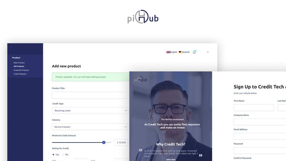
The system treats status, requirements and next actions as one product problem. Shared patterns create consistency across roles while allowing the actual workflow to change when the user, permission or financial task changes.
Dashboards surface what needs attention.
Applications focus on the information required now.
Verification explains who or what the process is waiting on.
Recovery states show how progress can continue.
The system treats status, requirements and next actions as one product problem. Shared patterns create consistency across roles while allowing the actual workflow to change when the user, permission or financial task changes.