Product design / Practical notes
Responsive SaaS Dashboard Handoff Notes That Engineers Can Use
A dashboard can fit a phone and still make the job harder. Write down which information must stay visible and how someone reaches the rest.
Write the task that must survive
I start with a task: find an unassigned lead and check its status. That tells me which relationships a smaller layout has to protect. Record identity, ownership and the next action matter more than preserving every desktop column.
If a detail moves out of the list, explain where it goes. The handoff needs to describe how the person continues, not simply which elements disappear.
Specify behavior by constraint
| Element | Rule to document | Review condition |
|---|---|---|
| Navigation | When and how it condenses | Location and current module remain understandable |
| Table | Column priority and overflow behavior | A record can still be identified |
| Filters | Panel entry, applied state and dismissal | The result context remains visible |
| Actions | Which remain persistent | The primary task is reachable without overlap |
| Detail | Reading order and expandable groups | Labels stay associated with their values |
Use the desktop screen to name the priorities
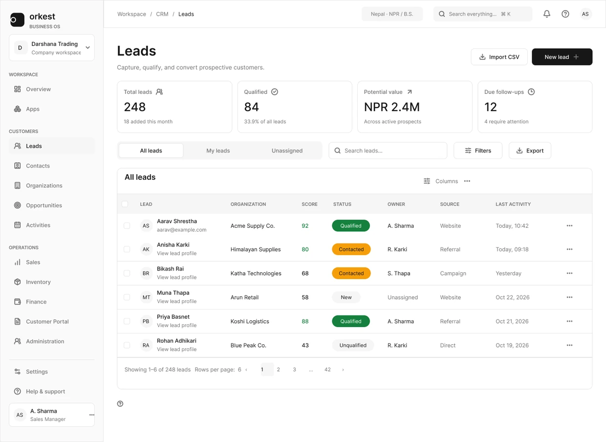
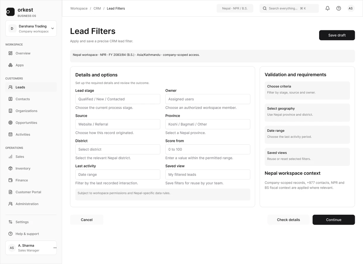
The Orkest list keeps ownership views, search and filters near the records. The filter design below adds another part of that task: choosing which records to see.
These are desktop examples. A mobile specification still needs to say how the filter panel opens, how the current criteria remain visible and where focus returns when it closes.
Document overflow and interruption
Decide whether wide data scrolls inside a labeled region, changes representation or moves into a detail view. If columns are removed, say how the person reaches them. Keep sort and selection behavior explicit when the representation changes.
Also inspect the mobile keyboard, fixed navigation, long translated labels and zoom. A layout that fits in a static screenshot can still hide the save action when the keyboard opens or leave focus behind a fixed control.
Test the transition, not only the endpoints
Resize with a selected row, an open panel and active filters. Check what persists and where focus goes. Review intermediate widths where neither the ideal desktop nor ideal mobile composition fits comfortably.
A useful acceptance note names an observable result: the record identifier remains visible; the selected action is reachable; the page itself does not overflow; closing a panel returns focus sensibly. Those checks are more durable than one breakpoint number copied from an artboard.