Product design / Practical notes
Designing the Handoffs Between People
A workflow becomes harder to follow when responsibility changes hands. These examples show how I think about ownership, waiting and the point at which a task is actually finished.
Separate acknowledgement from approval
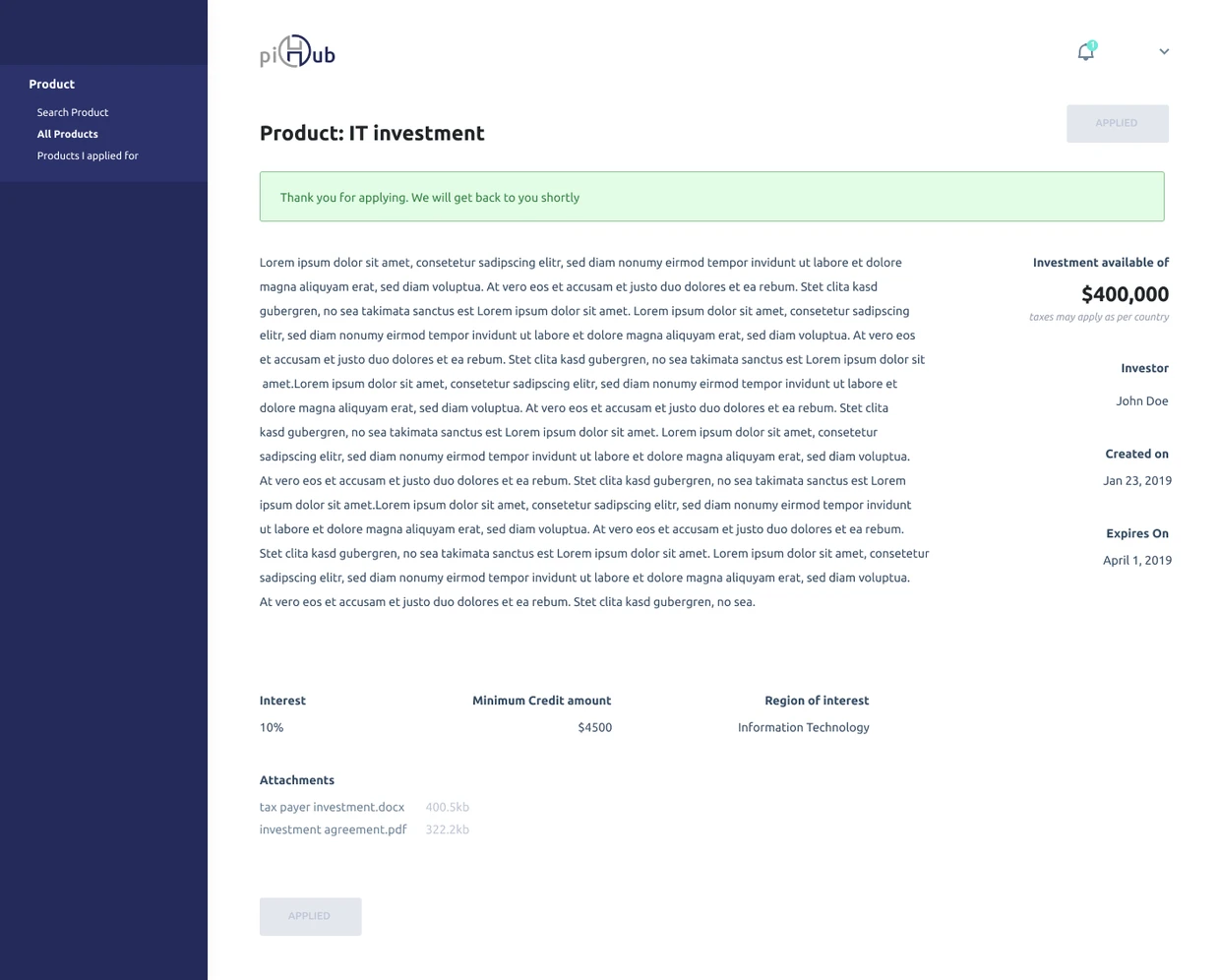
piHub’s application acknowledgement says Thank you for applying and shows APPLIED. That is a useful, specific message: the application has been received, while approval is still a later decision.
The person should be able to tell what was acknowledged and who acts next. The status needs that meaning in the working product as well as in the design.
The difficult moment is often between screens
A lead looks qualified. An application looks complete. A delivery looks close to finished. None of those states tells us, by itself, who should act next. When I review an operational workflow, I follow responsibility as carefully as I follow navigation. The useful question is: what can this person decide now, and what information will the next person need?
The examples here come from my portfolio designs for Orkest, piHub and Zapp. I use them to explain design decisions and the questions I would resolve before implementation. They are sample-data design screens, not evidence of measured business results.
First, make ownership visible before asking for action
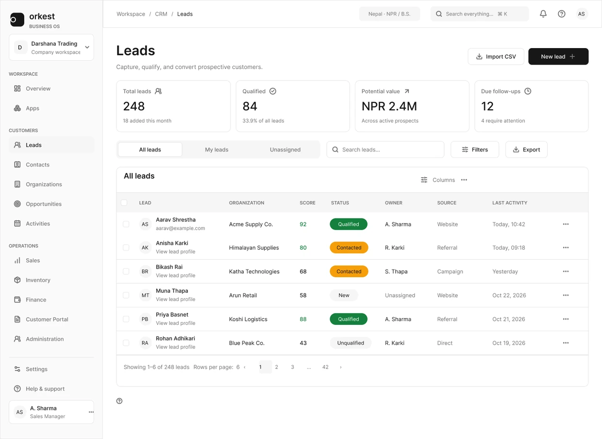
In Orkest, the lead list separates All leads, My leads and Unassigned. That distinction matters before a score or a conversion action: a record without an owner is a different operational problem from an owned record that is not ready. Keeping ownership near search and filters makes it part of the working context.
The trade-off is density. Adding every signal to the list would make comparison harder. I would keep the list focused on triage, then use the detail view for the supporting information needed to convert. A useful review task is to ask someone to find a qualified but unassigned lead and explain what they would do next. That is an evaluation proposal, not a result from a completed study.
Then, design waiting as a legitimate state
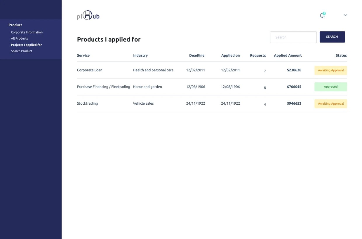
The piHub creditor view shows Approved and Awaiting Approval as written statuses. In a workflow that crosses creditor, investor and administrator roles, waiting is part of the product. A person should be able to distinguish a submitted application from a draft without guessing from a colored badge.
The screenshot establishes the comparison view; it does not settle the notification rules. Before handoff, I would specify who can change each status, what explanation accompanies a rejection, and where the creditor returns to correct information. The design responsibility is to make those transitions explicit rather than hiding them behind a generic success message.
Keep progress separate from completion
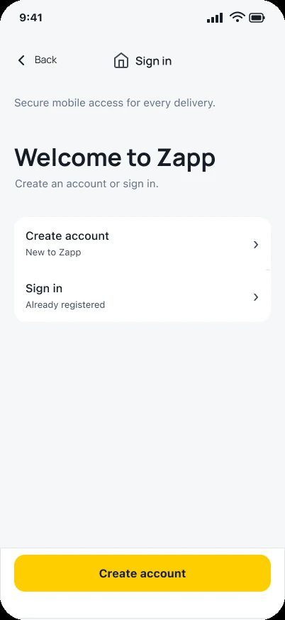
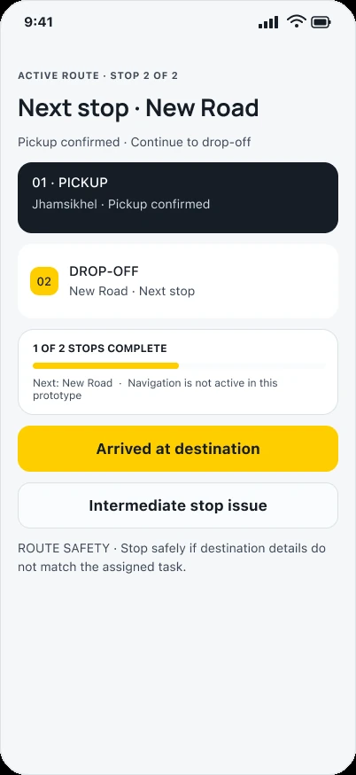
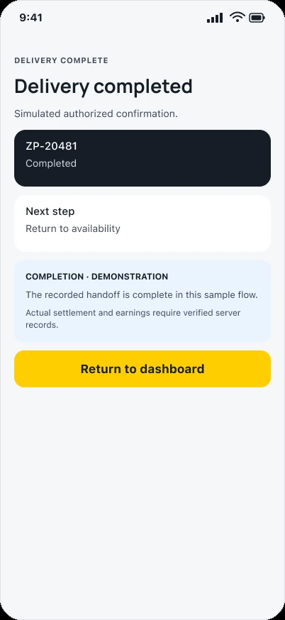
Zapp gives a driver a next-stop view and a separate delivery-completion view. Arriving near an address and finishing the handoff are different events, so the customer and driver need compatible accounts of what has happened.
The completion screen below also distinguishes the handoff from settlement records. I would agree what counts as completion, what happens when the recipient is unavailable and what the system retains after an interruption.
The handoff note I want beside the frame
I finish this kind of review with a short behavior contract. It records the current owner, permitted action, information carried forward, next owner and recovery path. If the team cannot agree on one of those, another polished screen is unlikely to resolve the ambiguity.
The journey is complete when a reader can explain the next decision and its consequences. In a portfolio, that means showing enough of the original screen to preserve context, explaining the trade-off, and being clear about what still needs validation.
- Name the role that owns the next action.
- Show whether the item is editable, submitted, waiting or complete.
- Specify what persists when the transition fails.
- Test the transition across roles, not only each screen in isolation.